Throughout history there have been a number of extremely meaningful volatility spikes across major financial markets. Each had defining characteristics that made them similar, despite occurring in very different markets and for different reasons.
The continuity seen across these volatility cycles is a good thing, because while it doesn’t necessarily make a major volatility spike predictable, historical precedence offers a blueprint for identifying conditions that are supportive for a potential vol-event to occur, and how they are likely to unfold once in motion. This can be of great help in guiding trading decisions, whether that is to steer clear of a potential vol blow-up or move towards it with the appropriate strategy that can take advantage of the outsized price swings that come with unusual levels of volatility.
We will first discuss what a volatility event typically looks like in terms of the behavior of volatility itself, then take a close look at some of the largest spikes ever witnessed in major financial markets.
What is Volatility?
“In simple terms, volatility can be defined as the variations at which a market fluctuates. The more an asset’s price moves, the higher the volatility – the less the price moves, the lower the volatility.”
– Paul Robinson, DailyFX
In this piece we are looking at a short-term measure of volatility (two-week duration) called Realized Volatility, which is volatility as it has already occurred. It is also known as Historical Volatility.
What Does a Volatility Event Cycle Look Like?
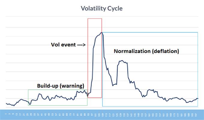
In the lead-up to a volatility spike, there is often a build-up period where volatility rises gradually, indicating markets could be headed for significant dislocation and disruption. The period of subtle unrest is followed by a sudden, vertical move in volatility that reaches a climax before quickly reversing and normalizing through a gradual, but bumpy decline towards pre-event volatility levels.
The graph below is a composite of several past volatility cycles, accounting for 100 days before and after the peak in volatility. Notice the build-up period, the volatility spike itself, and the normalization phase, as well as the asymmetry between the phases.
Cycle of a volatility spike
Source: DailyFX
Behavior of Volatility Differs Among Asset Classes
Another aspect of market volatility to understand is that it doesn’t behave in the same way across all asset classes, nor necessarily even within the same asset class. For example, stock market volatility generally behaves differently than it does in currencies and commodities.
Stocks have had an inherent long bias to them, as they are generally an asset of appreciating value over the longrun.
Market participants invest in company shares, making the stock market almost an exclusively long market with limited short interest. Because of this bias, volatility runs high in down markets when there is fear as a result of financial losses and selling, and low in up markets where fear is minimal.
Occasionally, you will see stock market volatility rise in a bull market as participants collectively suffer from FOMO, but this isn’t the norm and only happens towards the end of long, powerful trends – a couple of which we will look at here shortly.


Recommended by Paul Robinson
Building Confidence in Trading
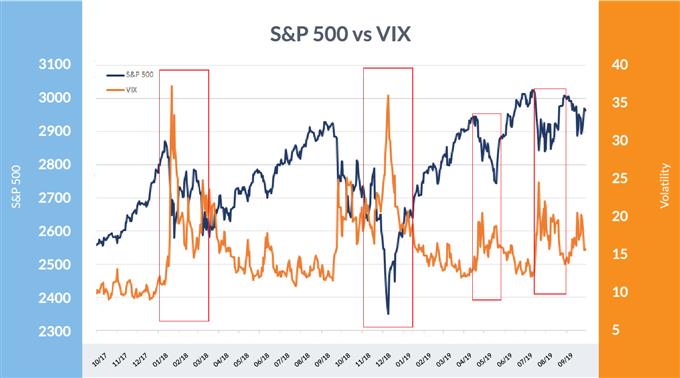
VIX demonstrates that volatility tends to rise on selling, decline on buying
Data Source: Bloomberg
As shown in the graph above, volatility typically runs opposite of the S&P 500, especially when the market declines.
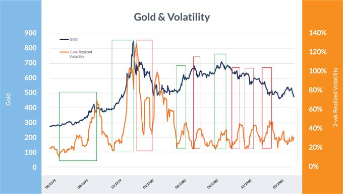
Over the long-run, currencies and commodities don’t have a natural bias to them and tend to oscillate in large bull and bear cycles that end in minimal net change. Volatility can rise in either direction and isn’t consistent over time. In the case of commodities (i.e. gold), volatility can actually be more likely to rise with a price rise than during a decline. But again, this is not wholly consistent across a cycle.
Gold vs two-week realized volatility
Data Source: Bloomberg
In the graph above, the green boxes mark periods when volatility rose while price appreciated, and the red boxes mark periods when it rose while the price of gold depreciated. This highlights the non-directional bias that volatility can have in commodities – the same also holds true for currency volatility.
A History of Market Volatility: The Biggest Volatility Cycles
We’ll have a look at the some of the most significant volatility cycles that have happened in the major financial markets since 1929 and investigate their build-up, peak, normalization phase and after-effects.
Crash of 1929
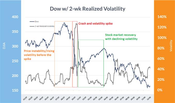
At the end of the roaring ‘20s’ bull market, the crash of 1929 kicked off the Great Depression of the 1930s. The October 28-29 crash in 1929 is particularly noteworthy and resulted in a two-day loss of 24% in the Dow Jones Industrials Average, with two-week realized volatility rocketing to 127%. In the short-term aftermath, the Dow price spent the next two weeks closing 6% higher or lower from the prior day’s session.
As was the case with the death of other major historical stock markets, the crash didn’t come from all-time highs (ATH), but after a period of weakness that caused volatility to rise ahead of the major spike. Heading into the late-October rout, the market was already off the ATH by 21% with short-term volatility rising from only 11% to 81%.
After the initial episode of the 1929-1932 stock market decline, volatility initially normalized by falling from a two-week reading of 127% to under 10% in about five months’ time. Volatility would ramp up again later, but did not exceed 100% again until almost two years later, when the worst part of the bear market drew near its conclusion.
Dow Jones Industrial Average: 1929-1931
Data Source: Bloomberg
In the chart above, volatility spiked sharply (red) after weeks of rising in an unsteady market (orange), then dropped sharply (green) as market confidence firmed up in the wake of the two-day crash.
Silver 1980
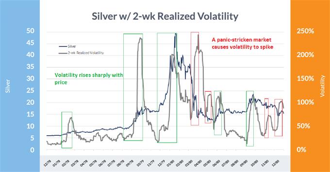
During the late 1970s/80s period, the Hunt brothers attempted to manipulate the price of silver in what was one of the most famous market ‘cornerings’ ever. It wasn’t just the brothers’ trading activity though: inflation was rapidly rising, and precious metal hedges were in high demand. Silver topped out at over $49 after trading at only $6 a year prior.
During the spectacular price rise, volatility at times rose sharply with each major surge, including the final one that concluded in January 1980. Volatility declined during the initial portion of the sell-off before spiking to near record levels as the market panicked out of long positions during the spring of 1980. From there it was a bumpy ride, but the two-week realized volatility declined to only 12% a mere five months after super-spiking to 240%.
Silver: 1979-1981
Data Source: Bloomberg
In this chart, the green boxes highlight the volatility spikes during bullish phases and the red boxes when volatility spiked on selling. It is clear there was a larger tendency for volatility to rise with the price of silver versus when it fell.
Black Monday – 1987
The 1987 stock market crash in the United States was in large part blamed on ‘program trading’, the first technology/financial engineering-driven crash of its kind. However, massive speculative excesses were built up prior to the crash, unlike anything since the 1920s.This played a significant role in the decline of stock prices and the massive spike in volatility.
The one-day, 20%+ decline in the major averages was of course a significant surprise – outside the possibility of projection – but as has been the case with most other major volatility cycles, it didn’t exactly occur out of the blue.
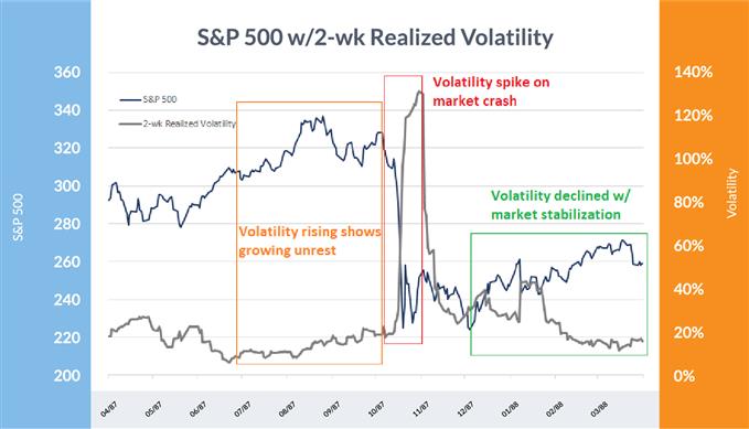
During the last ~10% of the bull market, two-week realized volatility rose with the S&P 500 from 8% to 15%, highlighting growing instability in the uptrend. By the time Black Monday rolled around, the SPX had already declined from the high by 16% while volatility was materially higher with a short-term reading of 25%.
Short-term volatility spiked to over 130% in the wake of the Monday collapse in stock prices before easing off and eventually dropping back to near 10% by the following March.

Recommended by Paul Robinson
Get Your Free Top Trading Opportunities Forecast
S&P 500: 1987-88
Data Source: Bloomberg
Growing unrest (orange) shows volatility increasing as the market is still in a bullish phase. When Black Monday rolled around, volatility went spiraling higher (red) before dropping off after the market stabilized (green).
Great Financial Crisis (GFC) 2008
The Great Financial Crisis was driven by irresponsible banking practices on Wall St. that eventually came at the cost of Main St. The decline from 2007 to 2009 was the largest plunge in both stocks and the economy since the Great Depression, but it wasn’t without some type of warning that a major blow-up in volatility could be in the works.
Just before things got really wild in the fall of 2008, two-week volatility was already at 41%. From there, the S&P 500 fell another 27% in about five weeks, which saw short-term volatility rocket to 97%. During that time, the widely-watched VIX index exploded from 36 to 80. In the year following, volatility normalized with two-week realized vol and the VIX hitting 20% and 23, respectively.
But even going back to 2007 before the bear market began, like in so many other bull markets nearing their conclusion, volatility began creeping higher. Despite the S&P 500 having gained about 8% YTD up to the October 9, 2007 high, the VIX itself had also risen from around 12 to 16 – a 25% increase. The wheels on the bus were beginning to wobble despite all looking well on the surface.
S&P 500: 2007-08

Data Source: Bloomberg
Looking at the chart above, one can see volatility was generally heading higher (orange) prior to the big spike in 2008. Once panic hit a zenith (red) and market confidence came back, volatility died down (green).
AUD/USD: 2008-09
Data Source: Bloomberg
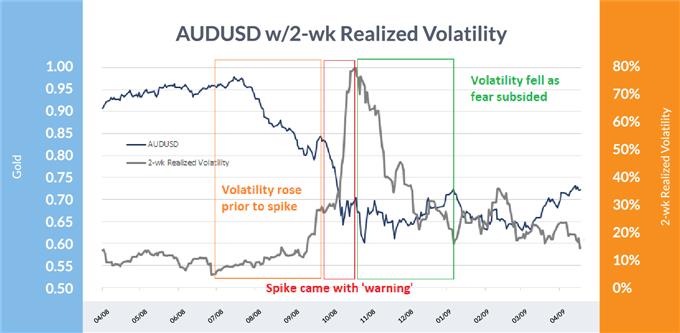
Turning to currencies, one of the biggest casualties of the Great Financial Crisis was the Australian Dollar (AUD/USD), which plunged nearly 40% as two-week volatility spiked to 80% from just single digit levels a few months earlier. Australia’s strong export ties to China proved to be costly when the emerging economy’s growth rate took a serious hit during the global recession.
The rout wasn’t a total surprise, as few are; volatility rose steadily in the months prior to the final collapse of Aussie. Short-term volatility climbed from a mere 5% in July 2008 to nearly 30% before the final spike to 80% occurred into October. Once AUD/USD bottomed there was a fairly sharp drop in volatility before it tapered off during the first few months of 2009.
Other currency pairs were also hit in a big way, such as EUR/USD and USD/CAD, but volatility never escalated like it did in AUD/USD. Volatility in those pairs rose to ‘only’ 30-40%, which is still extremely high for currencies.
S&P 500 E-Mini Flash-Crash 2010
The first major flash-crash to speak of occurred on May 6, 2010, when the S&P 500 e-mini futures were rocked by over 6% in about seven minutes before erasing all losses in less than fifteen minutes.
A London-based trader, Navinder Singh Sarao, was accused and found guilty of ‘spoofing’ – the placing of large orders which are cancelled just before getting filled.
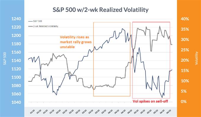
Now while this may have contributed to the decline, the market was already in a fragile state to begin with, as is typically the case when flash-crashes occur. To put volatility into perspective, the VIX had risen from 15 to 25 in the weeks prior, before rocketing past 40 on the day of the crash. Volatility actually didn’t finish rising until about three weeks later when the VIX hit 48. From there, volatility declined in typical fashion until early 2011 before popping again.
S&P 500: 2010
Data Source: Bloomberg
The S&P 500 e-mini flash-crash showed afamiliar theme: the orange box highlights a period where stocks were still generally heading higher but the unrest underneath the hood was becoming apparent via rising volatility. The spike and higher levels of volatility (red) followed suit along with the May 6 flash-crash.
EURCHF blow-up 2015
Of the blow-ups in volatility, this was one of the more surprising. The Swiss National Bank (SNB) had a floor in the EUR/CHF exchange rate that caused wide-spread complacency in the market and fueled the ‘thinking’ that the central bank would keep the cross supported. As it turned out, this was not the case.
When the SNB removed the floor, EUR/CHF collapsed from 1.20 – depending on the quote source – to as low as 0.68. Short-term volatility went from virtually zero to nearly 100% in a flash. It only took days to take back most of the spike, but vol spent the next three months slowly normalizing.
EUR/CHF: 2014-15

Data Source: Bloomberg
With the SNB floor in place volatility dropped to nearly zero (orange), but once the floor was lifted the market was caught off guard, causing volatility to rocket to over 100% (red) before backing off once the dust had settled (green).
Brexit 2016
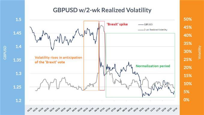
The Brexit vote in June 2016 wasn’t expected, despite it being a possibility, as evidenced by the way markets were hammered when the vote came out in favor of the UK leaving the European Union. Sterling was in a near-term upswing right before the results were announced, but GBP/USD ended up closing down 8% on the day that the vote was finalized. Two-week realized vol exceeded 46% thereafter.
This was a known event to take place, so there was no surprise to see volatility rise ahead of time in anticipation – nevertheless, volatility provided a warning that things could get dicey. In the month before the vote, two-week realized volatility rose from a mere 6% to over 16% as market participants weighed in on the potential outcome, one that the market wasn’t fully prepared to handle even with warning.
Post-Brexit vote, volatility initially cratered from 46% back to 16% in only about a month before entering the typical post-event grind towards normalization of around 7% in six weeks’ time. A few months after that there was the Pound flash-crash in October that again saw volatility spiral higher momentarily.


Recommended by Paul Robinson
Access the most recent GBP Forecast
GBP/USD & Vol Chart
Data Source: Bloomberg
Above it can be seen that volatility rose in anticipation of the Brexit vote (orange), then rose sharply on the surprise Brexit outcome (red) to eventually fade in the aftermath (green).
Volpocalypse 2018
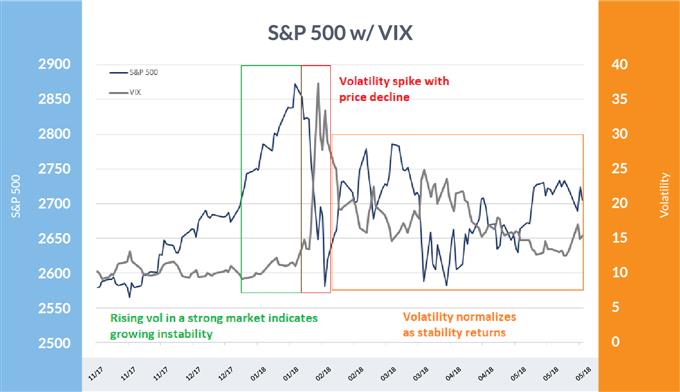
The ‘Volpocalypse’ of February 2018, while nowhere near as dramatic and damaging as the ’87 crash, didn’t exactly happen out of the blue. In the final months of 2017, U.S. stocks accelerated higher in an unsustainable fashion, taking vol with it – two-week realized volatility rose from just 3% at the end of September to around 8% at its peak in January 2018.
After stocks peaked in late January, the market began to decline for about a week before the indices plunged and volatility shot up. The Dow experienced a 4% flash-crash in the span of about ten minutes.
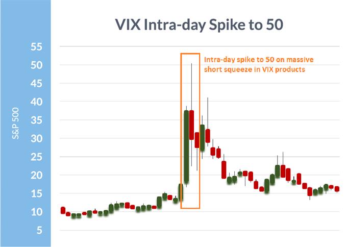
The VIX, the most popular measure of broad stock market volatility, saw an extremely unusual spike as the market was caught betting heavily on low levels of volatility via futures, options, and ETFs aimed at direct bets on the level of the VIX. This caused an exaggerated move in the VIX that pushed it to an intra-day high of 50. Like most vol blow-ups, this one too spent several months normalizing to pre-event levels.
S&P 500 and VIX: 2018
Data Source: Bloomberg
Above, you can see that volatility began rising during the last stage of the blow-off rally as it became unstable (green) and rose further on price weakness before super-spiking on a sharp decline in stock prices (red), followed by a period of normalization (orange).
VIX Hits 50 intra-day
Data Source: Bloomberg
The intra-day VIX spike was much larger than the actual stock market decline would have caused under ‘normal’ circumstances, but massive short VIX bets helped fuel it much higher.
Market Volatility Going Forward
Major volatility events have always been a part of financial markets and always will be. Understanding what they look like and having historical precedence to operate as blueprints offers traders a framework to operate within going forward.
Download the IG Client Sentiment Report to discover whether our traders are going long or short, how this is changing over time, and whether market signals are bullish or bearish.

 Signal2forex.com - Best Forex robots and signals