Forex EA robot FOREX V PORTFOLIO v.11 for 14 currency pairs (MT4 EA)
$249.00
Profit to deposit per month: up to 300% monthly
Max starting drawdown: up to 25%
System: Metatrader 4
Need Metatrader indicators: included
Timeframe: H1
Currency pair: AUDCAD, AUDCHF, AUDJPY, AUDUSD, CADCHF, CADJPY, EURAUD, EURCAD, EURGBP, EURUSD, GBPUSD, NZDUSD, USDCHF, USDJPY,
Limits by accounts: no
Broker account: any
We care about our customers and everyone will receive free technical support and periodic product updates.
Direct payment link: Bank card payment link

Description
We are constantly working on improving our forex trading strategy and have released this new Forex EA robot. Robots receive signals for opening deals from indicators included in the pack. Using a large number of currency pairs and small lots, Forex trading is absolutely safe. At the same time, while trading 28 robots, you can get a large percentage of monthly profit.
Average profit forex ea robot monthly: up to 300% of deposit
Max starting drawdown: up to 25%
System: Metatrader 4
Need Metatrader indicators: 12 indicators are included
Timeframe: H1
Currency pair: AUDCAD, AUDCHF, AUDJPY, AUDUSD, CADCHF, CADJPY, EURAUD, EURCAD, EURGBP, EURUSD, GBPUSD, NZDUSD, USDCHF, USDJPY,
Limits by accounts: No
Limits by time: No
Type of trading: Middle-term automated trading 50%, Long-term automated trading 50%
Neural network: middle
Number of signals using in trading: 6
Moneymanagement: yes
Using with other forex EA: yes (do not use magics 10xxx)
Broker account: any
Max. spreads allowed: : internal spread auto security
TakeProfit and StopLoss: auto (SL), up to 55 (TP)
Duration of trades: average 4 hours – 4 days
Lots: 0,01 – 100
VPS or Laptop: need 24/5 online
Min. configuration of VPS, Laptop: 1 core, 1 GB RAM
Live streaming forex trading from our account
Using indicators:
Pattern Recognition – an information technical indicator that finds and displays a number of the most popular figures of candlestick analysis and on its basis sends signals.
Keltner Channels are volatility-based envelopes set above and below an exponential moving average. Keltner Channels are a trend following indicator used to identify reversals with channel breakouts and channel direction. Channels can also be used to identify overbought and oversold levels when the trend is flat.
Linear Regression – trend indicator. Its main task is to point to the current trend. Its direction and strength, as well as signaling about market corrections.
Aroon Up & Down indicator – defines local vertices and valleys on the chart and provides signals to buy and sell currency pairs when they rise from the bottom or fall from the top.
BBandWidthRatio – indicator is based on the Bollinger Bands and is used to determine market volatility.
Commodity Channel Index – The CCI compares the current price to an average price over a period of time. The indicator fluctuates above or below zero, moving into positive or negative territory.
Momentum – technical indicator, the purpose of which is to measure the amount of change in the price of a financial instrument for a certain period.
RSI – the relative strength index (RSI) is a momentum indicator, that compares the magnitude of recent gains and losses over a specified time period to measure speed and change of price movements of a security. It is primarily used to attempt to identify overbought or oversold conditions in the trading of an asset.
TEMA indicator – a technical indicator used for smoothing price and other data. It is a composite of a single exponential moving average, a double exponential moving average and a triple exponential moving average.
How much can you earn with forex EA robot? Lots and deposits
- Minimum deposit for MT4 EA is 800$ for standart account or 800 cents (8$) for micro account if use all 14 pairs. Forex trading will be with 0.01 lots or such amount of deposit.
- If you have standart account, you can use smaller deposit, but quantity of robots need to be reduced according to deposit (look for the table).
- Profit up to 300% monthly in depending on market activity
- Maximum floating DD no more than 25%
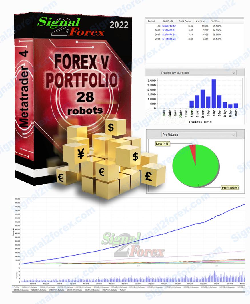
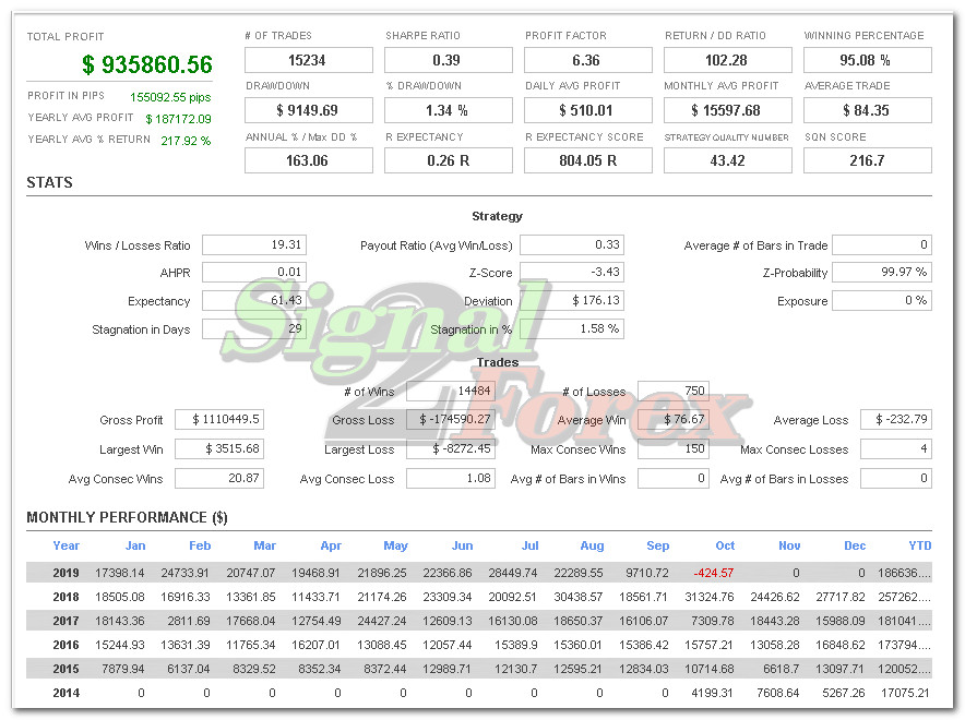
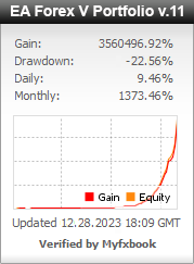
Profit chart of forex EA robot
How to start forex trading with our forex bot
Open Account
Open MT4 broker account (example Exness broker) or use existing. You can use any popular broker with middle spreads and any type of account (standart, ECN, micro, cent, PRO).
Make an initial deposit: Minimum deposit for high gain portfolio is 200 usd with 6 pairs using. 800 usd with 14 pairs using. With cent account you can use 8 usd to have 800 us cents on account.
Install MT4
You need to have PC, Laptop (online 24/5) or VPS for trading platform Metatrader 4.
To ensure the 24-hour operation of the MT 4 we recommend this Forex VPS Provider
Set Up Forex EA
Download forex trading bot from our site after payment and install it to the Metatrader 4 according to this video tutorial.
We can help with installation EA via Anydesk.
How to buy forex EA robot
If you want to buy Forex EA robot, You need place order on our site through the cart, enter your billing information and choose payment method. We accept online payments by Visa/Mastercard, Paypal, Webmoney. You’ll receive download link automatically after payment.
If you want use Skrill, Neteller, Swift bank transfers, Western Union, BTC, USDT please contact us and we’ll send you additional information.
Skype: Signal2forex
Whatsapp: +995511167545
Email: forexfactory1shop@gmail.com
Chat with us online on the web page – Jivochat
Pack includes next files:
1. Robots files
Signal2forex.com__AUDCAD_Timeframe-H1_ForexV_Sell_v.11.ex4
2. Indicators
QQE_ADV.ex4
RSI.ex4
TEMA.ex4
GenBuilder_Pattern_Recognition.ex4
KeltnerChannel.ex4
Aroon_Up_Down.ex4
AvgVolume.ex4
BBandWidthRatio.ex4
CCI.ex4
LinReg.ex4
Momentum.ex4
Pivots.ex4
Myfxbook.com accounts for the last 5 years
Do you still have questions about service and Forex robots Portfolio used?
- what broker and type of account is better to choose
- payment method, if there are restrictions for your location
- help with installation on your computer or VPS of the Forex EA
- account management service with the best MT4 EA
Skype: Signal2forex
Whatsapp: +995511167545
Email: forexfactory1shop@gmail.com
Chat with us online on the web page – Jivochat
49 reviews for Forex EA robot FOREX V PORTFOLIO v.11 for 14 currency pairs (MT4 EA)
Related Products
-
BUSINESS

Forex EA robot for sales – BUSINESS version with your own name and password system
Rated 5.00 out of 5$6,000.00 Buy now -

Forex EA, MT4 EA scalping bot – Golden bull
$99.00 Buy now -

Forex EA, MT4 EA Gegatrade Pro – robot based on average price
Rated 5.00 out of 5$99.00 Buy now -

Forex EA, MT4 EA scalping robot mt4 (scalper EA)
$49.00 Buy now -
Forex EA, MT4 EA INTRADAY trading robot
$49.00 Buy now




 Signal2forex.com - Best Forex robots and signals


Enrique –
Hola, excelentes robots e indicadores, un sistema, a mi criterio, seguro, confiable y muy recomendado. Hasta la fecha, ha logrado ya el 50% de beneficio (ganancia) antes de los 30 días! Sí tengo la consulta sobre cuál sería el proceso más adecuado para detener temporalmente el trabajo de los robots y poder retirar dinero. Saludos!
Liudmila Liudmila –
Guys are geniuses!!! I am grateful for your work!!! Everything works, they helped me install everything and there is always feedback !!! Thanks!!!
onlineshop681999 –
Hello, since 8.11 I have the program and for now I am satisfied, if you want to exchange information you can look for me on my skype Thanks!
Benjamin –
hi, do you have a Myfxbook track record? or FXblue? thanks
Admin –
Hello. You can find all our Myfxbook accounts on this page below, as well as a Live video of trading on our account.
Sofyan –
How to buy?
Admin –
You can buy a robot through the shopping cart. Click the Buy button and fill in your details. Then click Checkout and pay by card online. Next, you will automatically receive a link to download files. If you would like to pay in other ways, such as cryptocurrencies, please contact us.
aaashid_mir2 –
I have received my EA in the same time I have made payment. I could not install it myself and I wrote to support. They responded and helped with the installation only after 4 hours. I would like support to work faster, since i don’t have time to wait so much…. As long as EA works well and looks encouraging…look further
Tony Star –
everything works as described! Thanks
Georg Mat –
I installed the Forex Portfolio and it immediately started trading and opened 2 trades, after a while it opened more and more… All trades are the same as the trades on the YouTube video. Thanks for the bot and help with the installation..!
Majid –
Thank you for your robot.
I run it in demo account and results is good with 30 win trade and 100% win rate and drawdown 13%
I recommend this product.
Jivan Puri –
I have ordered and directly put in the live account, today after 9 days, it is working fine with 10% of DD and 160 USD profit on 800 USD balance. Recommended…..!
Thank you…Viladimir…!
Tibidabo –
Deseo saber si el bot Portfolio es el original o ha sufrido alguna modificcaión. También si tienen una versión demo para descargar y así probar. El bot es forlife y unlimited accounts?
Scott Smith –
someone i know recommend this EA and to be honest i had low hopes but decided to try it on demo. at first i thought it has to be some luck on this but i let it run on the default risk setting (1.3) on $1000 demo and it did very very well, i’ve now moved it to a live account on risk 1.0 and testing the demo on risk 2 (higher risk / more reward) to consider splitting my balance and have the higher risk feed profits into the lower risk. back testing on each pair / EA also shows a very very high win rate, very impressed and i’ll be recommending this to others for sure 🙂
luislubeiuro50 –
It has free trial, does robot really manage to reach the 300% range as stated in the description? which capital recommended? it’s safe to start with 200 usd
Benson –
Thank you for this bot. Vladimir you are a genius. I have use this bot for 3 months with no significant loss, I have made profit all through. Even in this trying times where Risk- off mood in the market points to further fall, megastorm has been resilient, and persistent in profit making. This EA is the real deal in forex trading look no further, this is the answer the answer. Aside your good product customer care is wonderful.
Zaid –
Thanks for this robot, I have run this more than 3 weeks now on 800$ deposit and made 255.72. 126 Trades closed and 1 loss due to news event. 15% draw down. I highly recommend this bot and sharing with my friends. Keep up the good work and thank you.
Lamine Ndiaye –
Good one
Ariel Cruz –
Gracias por desarrollar este sistema automático lo estuve revisando por 3 meses y por fin lo he comprado la asistencia fue excelente y desde que lo instale ya estoy ganando tal como se muestra en YOUTUBE.
Recomendadisimo….
Adeola Olanrewaju –
Customer Service has been impeccable……everything running thus far on demo account and will go live in April but very confident in this…..happy so far and also happy that this does everything automatically from adjusting sl and tp and adjusting the account for risk as well….AWESOME.
Bikash Chandra Sahoo –
Bikash here from India,I am quitely exited to know about this EA,I want to know that if I will pay $.249.00 then how may years it will work on my Metatrader-4 real account of mine?My Real MT-4 account fund is $.1000 then what lot size should set with EA ?If i will use vps ,then will it work nonstop automatically for whole month and generate profit ?please reply regard my all questions to my mail id bikashsahoo1247@rediffmail.com
Mehrad –
I bought and installed the robot on two accounts, on a demo and a real account. All trades match the video on YouTube, and I’m very happy about that. The robot has already opened many trades and made a profit of real $343, now there is $1373 on the balance. EA works, I hope it stays that way
Tian Mali –
Thank you for this wonderful EA. It trades on my Hotforex account automatically and sets the TP and SL by itself. The account balance is growing!!!
Rafael Cerqueira –
I started immediately on a real account as soon as I bought it, from 01/15 until today, I have a profit of + or – 11%, with a DD in the range of 8.5%, I am still finding it a little slow because I am at the beginning , but it has a lot of open order and in a little while it should start gearing up, I started with a capital of 1k, I’m enjoying it for now, I want to leave it for the same period that is happening on YouTube, between 6 and 9 months to arrive on his result!
pmfwade –
be careful of drawdown, but in general, nothing to say about this indicator it is incredible. Results are here, I trade with 150 euros for the beginning and in only 20 days i earn 130 EUROS
سعید سهرابی –
سلام. ربات خریدم ممنون کارش عالیه
Greg Croot –
Have now been running for 7 months on a demo and 3 months on a LIVE account. Both are in very healthy stages of profitability. Have to be aware of the drawdown but the fact it uses so many pairs it is constantly building the account and once in balance profit then DD is less to worry about. Cheers Greg
Hyunyop –
Hello, I wonder account on youtube is real or demo?
þorsteinn Hafberg hallgrimsson –
I have tested this ea on a demo account for a one month and 20 days with 50000usd balance and i had extremely good results balance after that time period 70000usd with open positions of -10000usd, 151 trades and one loss trade of total 151 trades. This is the best ea i have ever tested and i have tested a 10+ robot’s ea’s. Best thing i have put my hands on last 4 years. Big thanks to the owner of this. Thank you for this wonderful ea’s.
Giovanni Lorenzoni –
Dear Vladimir, Thank you for this system. I made an interesting profit despite not following your suggestions fully. I hope that next year will be just as profitable and this cursed Covid year can end quickly. I’m trying to get some friends of mine to buy this system, and hope to hear from you soon. My best wishes for good health and success. Giovanni
mauriciof458 –
So far so good, 100% winning trades with a couple of open positions. Customer service is great, and I’m currently requesting more passwords to have the EA on more accounts! – I was hesitant at first but everything shown on YouTube live is super accurate. As of now, 5 stars.
Josean Morais –
Good Morning! what is the minimum bankroll to start. Thankful!
hadiabdollahi –
با تشکر از تیم پشتیبانی برای نتایج عالی
hadiabdollahi –
سلام خسته نباشید من ربات را خریده ام ولی در راه اندازی ان دچار مشکل شده ام لطفا راهنمایی کنید تمام مراتب را رعایت کرده ام با تشکر از تیم پشتیبانی
Mohan –
Want to know more about EA. I am mohan from india. Let me know the details
Amir –
سلام من میخواهم ربات را تهیه کنم ولی لازمه تست کنم لطفا نسخه آزمایشی یک ماهه ارائه بدهید. ممنون
Forex EA –
Produkt funguje. Podpora pri inštalácii cez Teamviewer je 100%. Komunikácia na 100%. Ďakujem 🙂
cuccuru nicolas –
Grâce au service d’assistance, le robot fonctionne maintenant!!!
cuccuru nicolas –
j’ai acheté le robot hier soir, ce matin je l’ai installé dans MT4 et depuis ce matin il n’a pris aucun trade y a t’il quelque chose a faire ? sur MT4 j’ai les petits smiley sur chacun de mes graphiques, l’option auto-trade est activé…
欣庭 宋 –
超棒的EA…..才剛使用沒多久~就已經非常的棒了~~感謝所以團隊們!!
Dave_trader35 –
Thanks to your support team for helping to install this EA on my laptop. Trades are being opened and trading is in full swing!!!
oğuzhan –
merhabalar ürünü test etmek istiyorum deneme sürümü mevcutmudur acaba ? ona göre satın alacağım
luis –
disculpen quiero adquirir este bot pero me gusataria saber con que monto minimo su puede iniciar, para cuantos pares sirve paralelo, entiendo que son varios EAs, trabajando en conjunto como uno, y para cuantas cuentas sirve quedo atento a sus comentarios
نصرالله –
سلام من ربات را میخواهم خریداری کنم اما میخواهم قبل از خرید خودم امتحان کنم شرایط دریافت ربات به چه صورت است؟
Александр –
Купил на прошлой неделе, просадка на уровне 15%, доход планомерный. Буду дополнять отзыв.
Juan Camilo –
una pregunta, si instalo el robot en mi pc personal, ¿podría instalarlo después en un vps o debería comprar nuevamente el robot?
behraminko –
bir hafta kullanıyorum. Robot günde 10-15 işlem açıyor, kâr artıyor.
yong tang –
How can I buy it?
Alex Song –
Wonderful EA, 12 business days of tradering from $800 account had growth to $1004. Looking forward for February result. Cheer.
بابک –
سلام متاسفانه سرعت پاسخگویی بسیار پایین میباشد ولی ربات خوب است
ADEM KARATEPE –
It really works. I gain about %5-10 with low draw down. Thank to the author