YIELD CURVE AND STOCKS:
- Wall Street refers to the bond market as smart money because of its track record of predicting future economic outcomes
- When analyzing the interplay between bonds and stocks, traders often look at shape of the yield curve to glean insight into the business cycle and predict equity performance
- There are four fundamental yield curve regimes: bear steepener, bear flattener, bull steepener and bull flattener
Trade Smarter – Sign up for the Daily Newsletter
Receive timely and compelling market commentary from the Daily team
Subscribe to Newsletter
Most read: What is Stock Market Volatility and How to Trade it?
On Wall Street, traders frequently say that the bond market is the smart money because of its predictive power for output growth, inflation , and interest rates – three key variables for the broader economy and therefore for financial assets. Based on this perception, investors sometimes focus sharply on bonds, examining the twists and turns of the yield curve , hoping to glean information about future economic performance and emerging trends. The financial system is highly connected, so it is logical that signals emitted by one market can sometimes become an indicator – perhaps even leading – and a forecasting tool for another that is slower to or inefficient at incorporating new data.
In this article, we’ll look at the Treasury market to explore how the shape/slope of the yield curve can offer clues about expectations for future equity returns and sector leadership by providing insight into the business cycle. Before delving in, it is necessary to become familiar with crucial concepts.
Related: Economic growth – What is Gross Domestic Product?
TREASURY YIELD CURVE
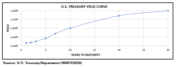
The Treasury yield curve is a graphical representation that plots government bond interest rates across different tenors for the entire maturity spectrum – from overnight to 30 years. It shows the return an investor would earn by lending funds to the US government for a given period of time, with the graph displaying the security’s yield on the vertical axis and borrowing period across the horizontal axis.
The curve may take different shapes, but in healthy environments , it will typically slope upwards as longer-term debt instruments will offer higher returns than short-dated ones to compensate for additional risks such as inflation and duration (see figure below). For example, the 30-year government bond will often have a higher yield than the 10-year note, which in turn, should have a higher yield than the 2-year Treasury note.
Recommended by Diego Colman
Get Your Free Top forex Trading Opportunities Forecast
U.S YIELD CURVE
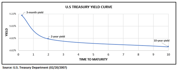
Although rare, at times, a long-term security may have a lower yield than a short-term investment, producing a downward sloping term-structure of interest rates . When this occurs, we say the yield curve has inverted.
Frequently, the yield curve tends to invert after the central bank has raised short-term rates to prevent overheating to the point that it is curtailing activity and weighing on the economic outlook. When monetary policy has become too restrictive, investors bet interest rates will have to decline in the future to address a possible downturn and disinflation. These assumptions cause longer dated bond rates to fall below short-term ones, causing the Treasury curve to invert.
Historically, inversions have frequently foreshadowed impending recessions. In fact, in the post WWII era, every yield curve inversion (of the 3-month to 10-year or 3m10y) has been followed by an economic slump.
Recommended by Diego Colman
Get Your Free Equities Forecast
INVERTED U.S. YIELD CURVE
Rather than focusing on the entire interest rate term structure of the Treasury market, traders will often compare two yields at two specific maturities and refer to their spread, measured in basis points, as “the yield curve”. The most analyzed and frequently referenced curves in financial media are the following:
- The 2-year/10-year curve also known as the 2y10y (referred to as twos-tens): This is the difference between the 10-year Treasury bond yield and the 2-year Treasury Note yield.
- The 3-month/10-year curve also known as the 3m10y (referred to as three month-tens): This curve represents the difference between the 10-year Treasury bond yield and the 3-month Treasury bill yield.
Recommended by Diego Colman
Building Confidence in forex Trading
2s10s and 3m10s curves since 2020
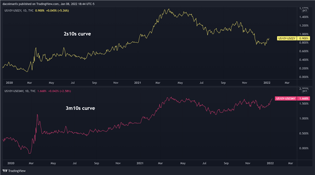
Source: TradingView
CHANGES IN THE YIELD CURVE
As economic activity, inflation expectations, monetary policy outlook and liquidity conditions change, so will the spread between long and short-term Treasury yields. When the spread increases, the difference between long and short-dated rates widen, and the curve is said to steepen . On the contrary, when the term spread compresses, the yield curve is said to flatten .
The term spread can change for many reasons; for example, it could flatten because long-term yields are declining and/or short-term rates are rising (or a combination of both). The twists and turns of the Treasury curve are an effective real-time business cycle indicator and can therefore help to develop interesting cross-market trading strategies. For instance, sophisticated stock investors will regularly look at the shape and slope of the yield curve to structure an equity portfolio aiming to capture an emerging economic trend.
THE FOUR DIFFERENT SHAPES OF THE CURVE TO KNOW
Here is a summary of the four fundamental yield curve regimes and how they can help predict sector leadership in the equity market.
Recommended by Diego Colman
Introduction to Forex Trading
- Bear steepener: long-term rates increase faster than short-term rates, steepening the yield curve. This is a risk-on environment that tends to appear during the early stages of the business cycle following a recession after the central bank has cut the benchmark rate and signaled it will keep them low for some time to support the recovery. Accommodative monetary policy creates a reflationary backdrop , lifting market-determined long-term rates amid improving prospects for future economic activity and inflation. The smart money considers this condition bullish for most stocks and especially cyclical sectors on account of faster earnings growth . During bear steepening, materials, industrials, and consumer discretionary stocks tend to rally significantly. Banks (financial), which rely on borrowing short and lending long, also perform well during these periods on the back of widening net interest margins.
- Bear flattener: short maturity yields rise faster than their long-term counterpart, compressing term spreads and flattening the curve. This regime takes place during the expansion phase and precedes the Fed raising the federal funds rate to keep inflationary pressures in check (the front end of the curve is primarily influenced by monetary policy expectations determined by the central bank). Volatility may be higher at times, but this remains a risk-on environment for stocks amid healthy earnings. It supports a constructive backdrop for technology, energy, and real estate.
- Bull steepener: short term yields fall faster than long term yields, steepening the curve. This regime tends to be risk-off and often appears early in a recession when the outlook is highly uncertain, and the central bank is cutting short-term rates to stimulate the economy. On balance, stocks don’t do well during bull-steepening periods, though defensive sectors such as utilities and staples tend to outperform the broader market while technology and materials struggle.
- Bull flattener: long-term yields fall faster than short-dated rates, flattening the Treasury curve. The narrowing of the spread is fueled by moves in the back end, driven overwhelmingly by market forces amid falling long-run inflation expectations and a deteriorating growth outlook. This regime, which foreshadows turbulence in financial markets, flares up late in the business cycle when investors start pricing a possible recession and disinflation. When bull flattening prevails, equity investors begin to tilt their portfolios towards higher quality plays as a hedge against rising volatility. Staples and utilities command leadership while cyclicals do poorly amid weakening corporate earnings for economically sensitive sectors.
Related: Stocks Sectors – The Basics You Need to Know
Recommended by Diego Colman
Options for Beginners
Note: The ‘bull’ and ‘bear’ signifier that describes each regime refers to what happens to bond prices. For example, in bear flattener, when short-term rates rise faster than long-term ones, short-dated Treasuries are being sold, prompting their prices to fall (bearish for price in this example). Keep in mind that bond prices and yields move opposite of each other.
The shape of the U.S. Treasury curve is primarily influenced by inflation expectations, prospects for output growth and the monetary policy outlook. Considering that the yield curve captures important variables about the economy of today and the future, it is a useful leading indicator of the business cycle. Based on this assumption, equity investors often use the shape of the curve as a forecasting device to predict stock market leadership, but this practice shouldn’t be done in isolation as bonds can give false signals as with any tool. That said, top-down and bottom-up analysis are often best served when creating a balanced, diversified and less-volatile portfolio.
- Are you just interested in the stock market? Download Daily quarterly equity forecast
- Would you like to know more about your forex trading personality? Take the Daily quiz and find out
- IG’s client positioning data provides valuable information on market sentiment. Get your free guide on how to use this powerful trading indicator here.
—Written by Diego Colman, Contributor
 Signal2forex.com - Best Forex robots and signals


